The playful, the personal and the purposeful – The aesthetics of optimization
“Is it a shop, or a huge display case?”
“Is it a gallery exhibiting racks of garments or a clothing shop that makes the racks into a piece of art?”
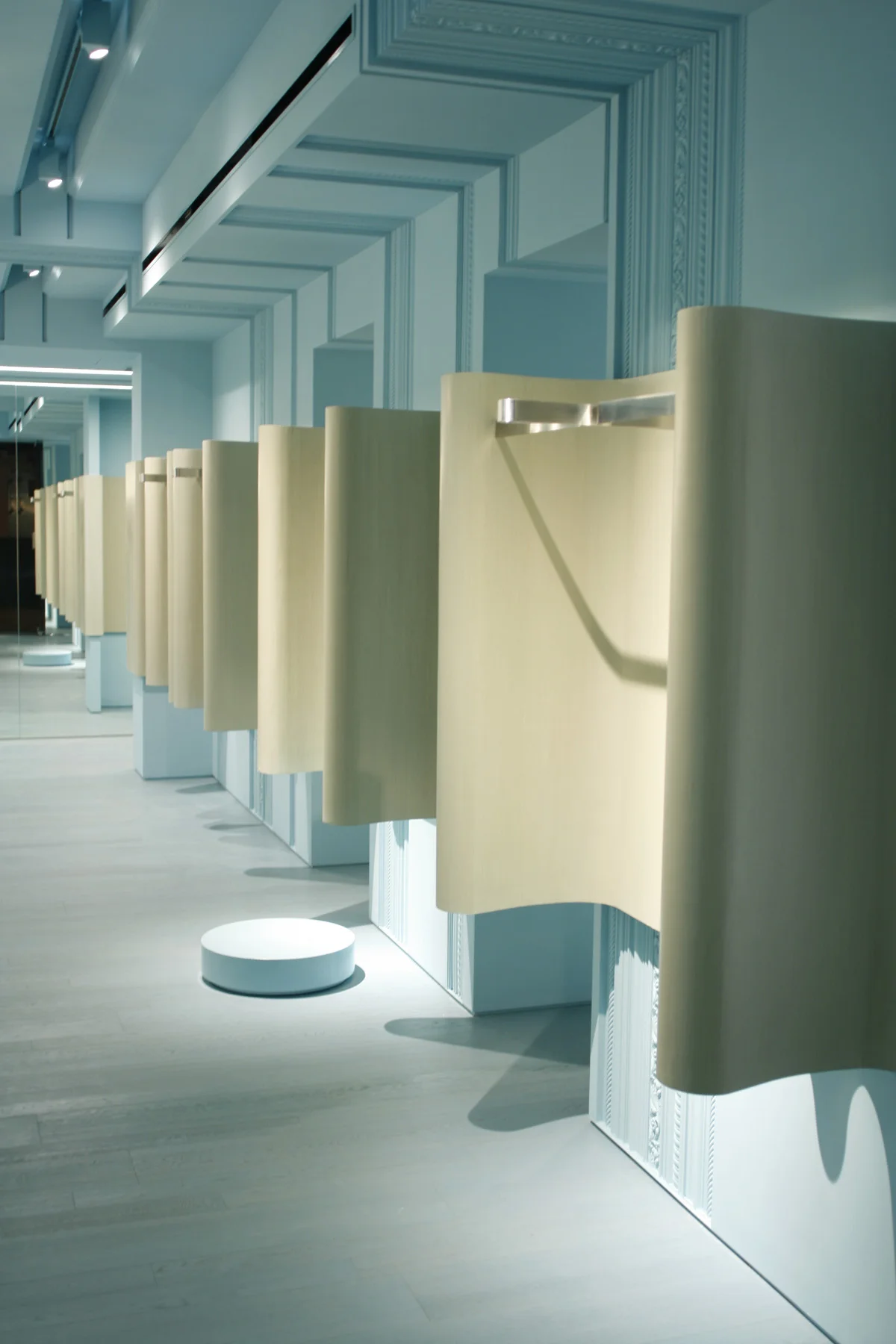
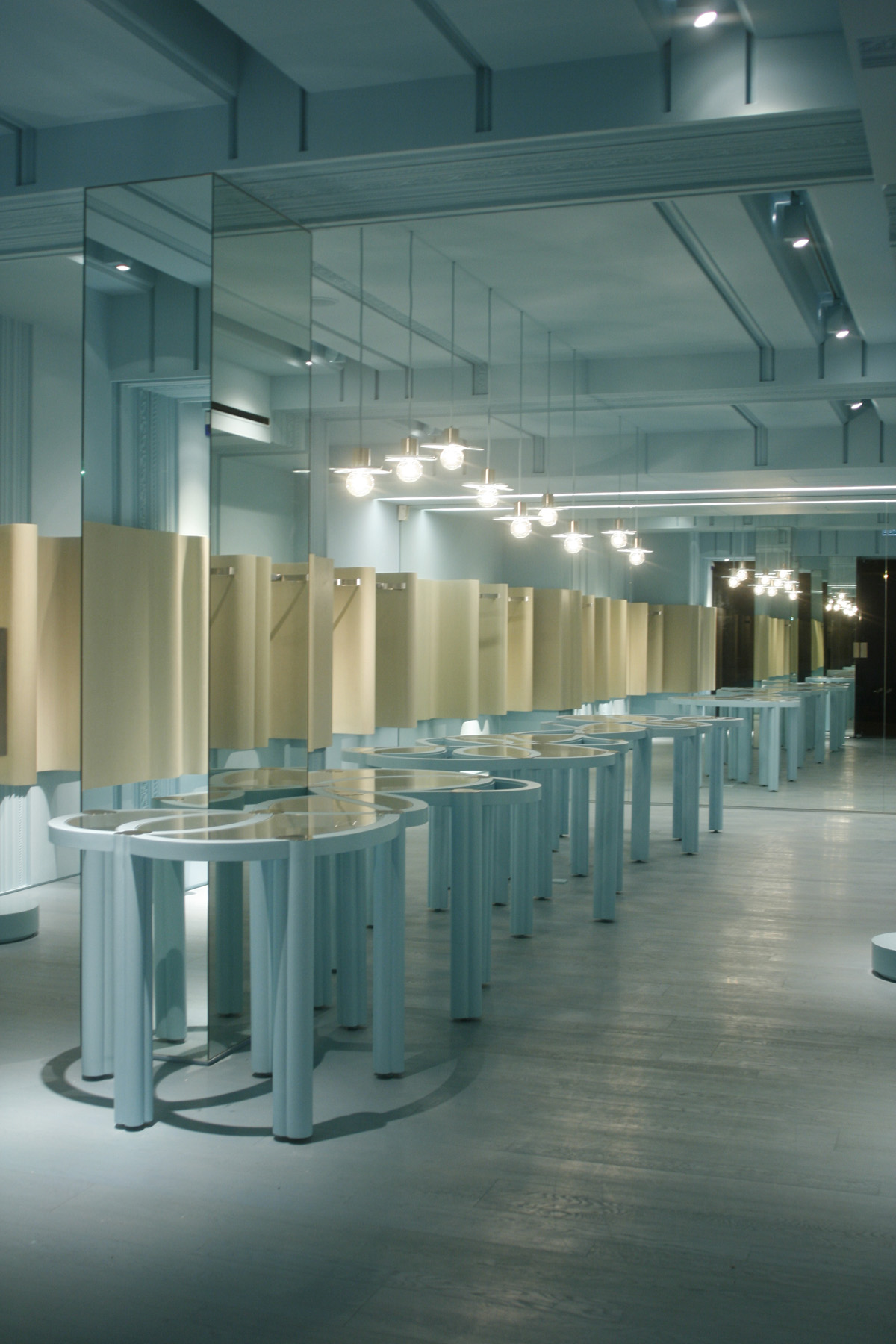
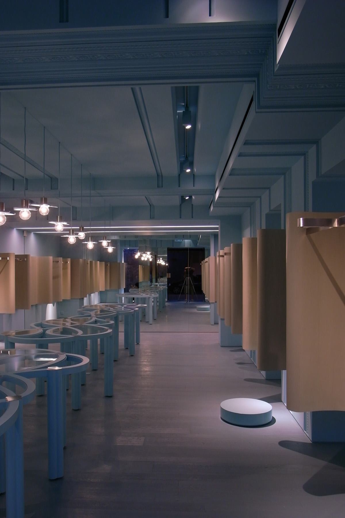
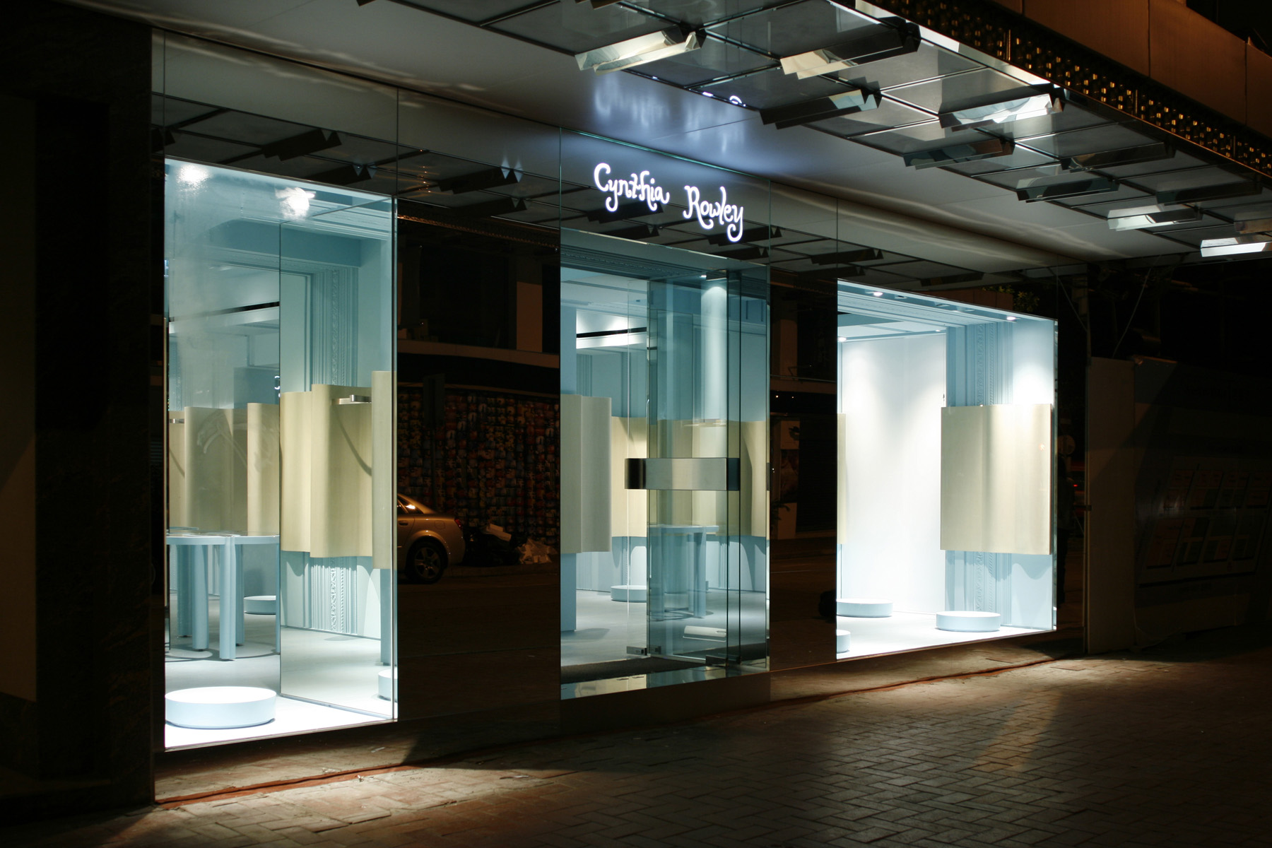
The entrance is not a beginning. The journey of discovery already starts in the street. The shop front architecture is deliberately dematerialized by mirror surface to leave only the brand name and the visual merchandise standing out. The interior installation speaks at a different scale. The length and extend of the undulating rack wall (finished in timber veneer but as thin as fabric) make it a gigantic sculpture that draws the shoppers’ attention directly to the inside of the shop.
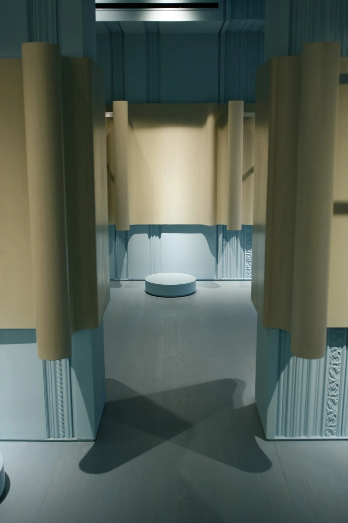
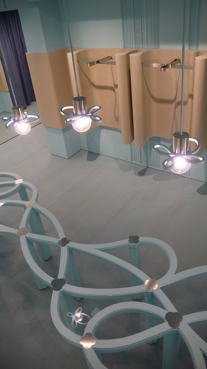
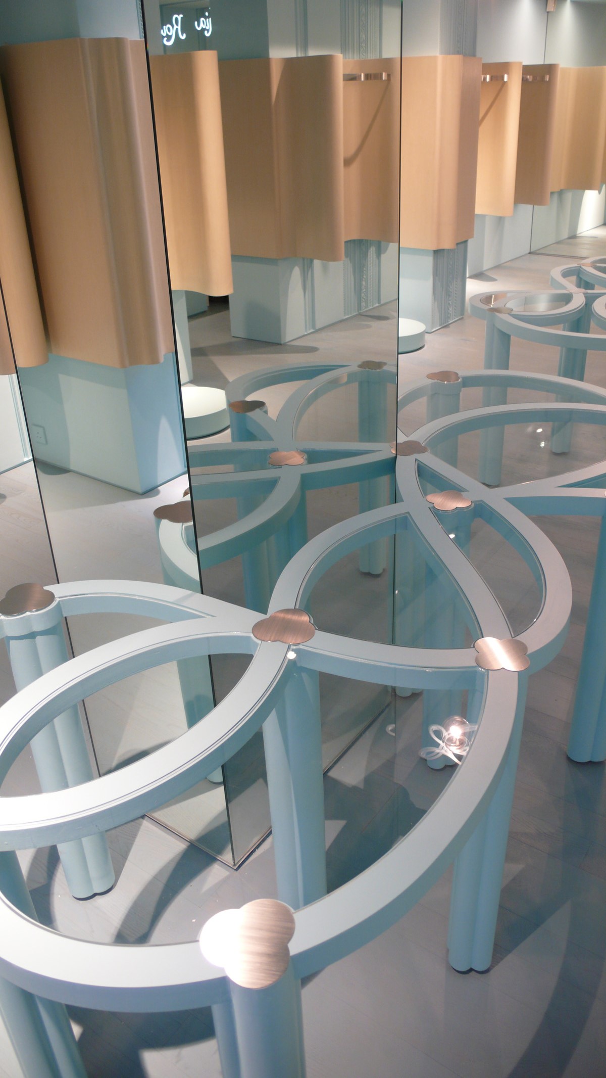
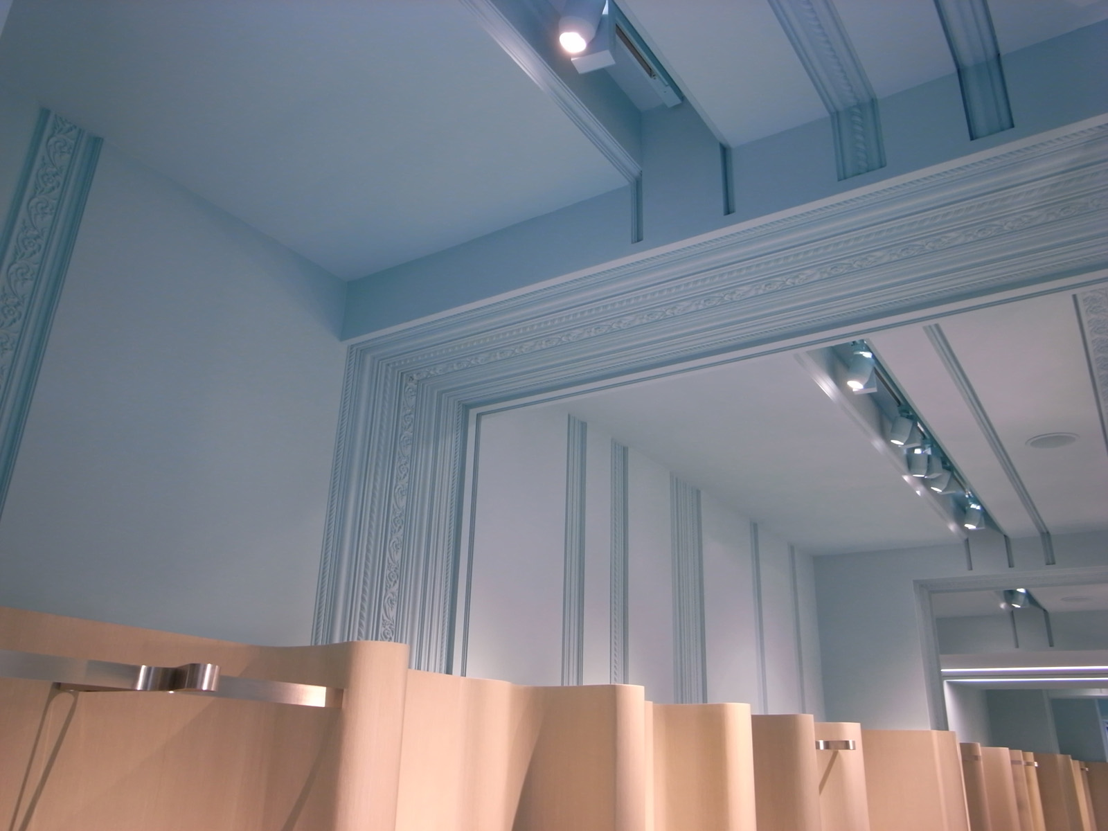
The rack wall is inspired by the imagery of a floating curtain. Beyond the artistic quality, it gives clarity to organize the display. Ultimately, clothing shop is about racks and shelves. The wavy band rolls around the walls and incorporates all functions of display. The neutral warm tone of timber sets a calm and pleasant backdrop for the clothes and mannequins. The display table follows the same datum and completes itself with an array of timber-shade floating lamps above.
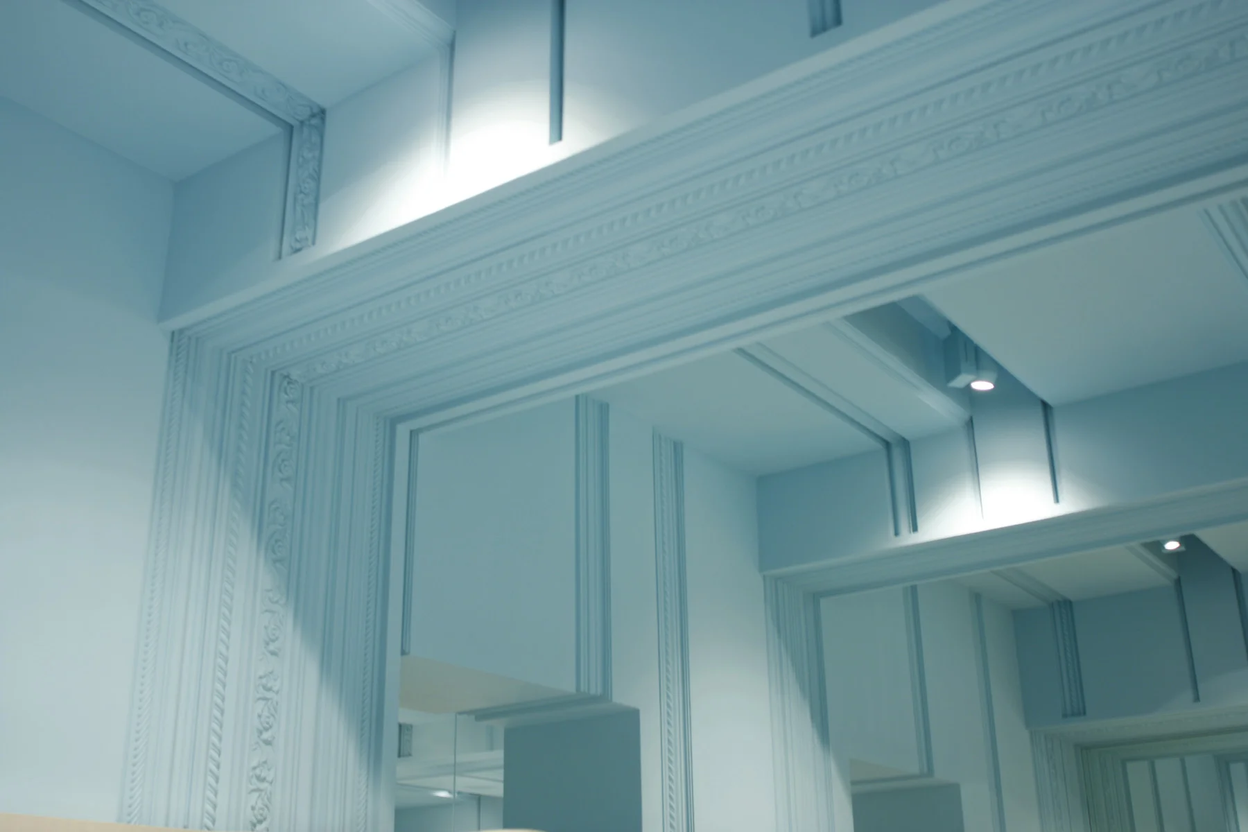
The rest of the shop is covered with a shade of blue and decorated with classic molding motif with a geometrical twist. The floor and ceiling painted in the same blue tone creates a consistent ambience with a bold presence. The tranquil expression of the blue shade subtly echoes the brand identity while does not overpower the merchandise.
The end wall, which lies parallel to the street, are finished in mirror to virtually double the depth of the shop. The reflected image of the shop ends with the mirrored street, which again reinforces the concept of bring in the surrounding environment.

